Designing navigation for web applications
August 22, 2009 · Chris Peters
I'm working on a web-based administrative application where you can install remote applications. The goal is to have a platform that provides a consistent UI, somewhat like SharePoint. (But less assy in general.)
I’m working on a web-based administrative application where you can install remote applications. The goal is to have a platform that provides a consistent UI, somewhat like SharePoint, but less assy in general and more flexible than what most portlet servers allow. Thinking about the way that applications work on Facebook is a good way to think about it.
The design problem
In my current design, the information architecture (IA) doesn’t have enough breathing room to allow for remote applications to have enough navigation options.
Navigation basics
In my mind, a website or web-based application has these standard IA elements for navigation:
- Global navigation - Shows a high level of what’s available in the information space.
- Local navigation - Shows what’s available in context of the current section of the information space (what section you’re in from the global nav).
- Contextual navigation - Shows navigation options in context of the current screen.
- Utilities - This is usually in the far upper right and contains user account, personalization, shopping cart, and help links.
Of course, if the information space isn’t complex enough, you may not need to use all of these elements.
This is very much based on navigation system concepts described by Lou Rosenfeld and Peter Morville in Information Architecture for the World Wide Web.
I’m surprised how many web designers that I run across who don’t understand these basic concepts, even though the major websites on the Web have all adopted this convention.
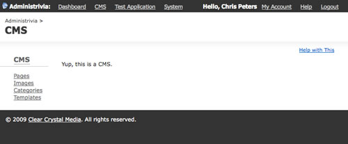
IA elements in use in current design
So I’m going to add that my design calls for a global navigation that is a level above the global navigation. It lists applications that are available to the user. I’ve been calling this the AdminBar. For all intents and purposes, the applications need their own global navigation as well.
Here’s how the navigation elements that I defined above map onto the current design:
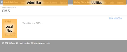
As you can see, this design doesn’t allow for a global navigation for the application that you’re current using.
I also have a deep hatred for websites and web applications that use the left rail for global navigation. You’re painting yourself into a corner, folks!
Sketch of new the IA
So I took out a sheet of paper (several, actually), a No. 2 pencil, and started sketching ideas of how I could have a global navigation. I knew that things would probably need to be rearranged a little. That’s why I used paper instead of Photoshop/Fireworks.
After 5 revisions, I came up with this:

Honestly, I borrowed the tabbed navigation from Basecamp and FreshBooks. But I think it works well with my requirements. (Plus their interface designers flat out rock, so why not draw inspiration from their work?)
So let’s examine this IA like I did with the original design:
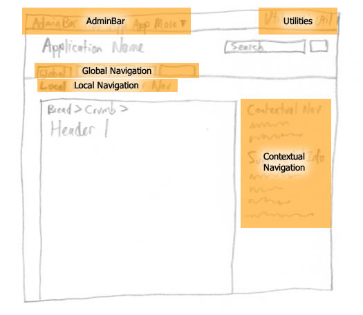
Pretty sweet. Now remote applications will be able to send the portal information about navigation options available within their information spaces. And they will have plenty of flexibility in case there is a lot of information to communicate.
Yet the interface won’t be so complicated as to be confusing. Hopefully this will provide a standard that’s useful for application designers and users alike.
Here’s what it looks like after some Fireworks love:
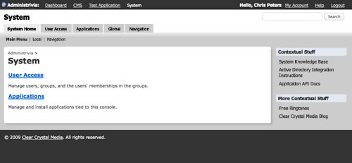
There you go. From pencil sketch to Fireworks comp. This is the stuff that gives UX guys wet dreams, isn’t it?
We need to do this more often
I think it’s worth pointing out that we as web developers need to do this sort of thing more often. Especially when we work on projects solo like I am right now.
I was getting so frustrated trying to picture what information the remote applications needed to provide and couldn’t see how it would work in my head. Now that I’ve sketched it up, I know immediately what I need to do.
I ran into this problem over a year ago. You’d think I’d have learned by now. :)
My next step is to test this with actual people to see if they understand the concept. This is an often underutilized step in the whole process. (“I want to build my application now, dammit!“)